As an established tour and activity operator with a large presence online, direct bookings via your website can be crucial to your business. If you're spending time and energy driving traffic to your website, you also need to make sure your website is prepped and primed for bookings.
Here are some ways to optimise your site: You can improve your site's layout to help visitors quickly find what they need. You can improve your product pages and product descriptions to give site visitors a taste of the experiences you offer. You can add a few lines of code to your website to display great reviews from TripAdvisor or Facebook. You can even install an online booking system that displays real-time availabilities so that customers can book and pay you on the spot.
There are a multitude of methods to improve your website's booking conversion rate without breaking the bank. In this blog post, I'll focus on how you can improve your Call-To-Action (CTA), also known as your "Book Now" button, to get more people clicking through and booking with you.
Here are 4 ways to optimise your CTAs to improve booking conversion rates.
1. Text
This might sound rather obvious but sometimes, the best advice is the simplest advice. The first rule of thumb is to keep your CTA copy as short and as concise as possible.
The next rule of thumb is to make sure that the text on your CTAs matches its actions. For example, below, you'll find two CTAs, one saying "Build your trip here!" and the other saying "Book Now!"
Click on the CTAs below to find out where they lead you.
Another thing to keep in mind is the text surrounding your CTA. So instead of "Create your diving getaway!", you could add text outside the CTA while keeping the copy inside the CTA short. Below is an example.
2. Colour
Depending on the article you read or who you speak to, you could end up with recommendations to colour your CTA all seven colours of the rainbow. This can quickly get rather confusing.
So let me clarify: there's no one specific colour that can be universally recommended. Every company owns a different website and every company has a unique brand and brand colours that you've invested a lot of time and energy on.
Don't throw your hard work away.
When it comes to your "Book Now" buttons, just remember to use colours that stand out and draw the eye. Use complementary yet contrasting colours, not colours that blend into the rest of your website.
If you have multiple CTAs, each one directing users to a different action, you'll need to prioritise.
Let's check out Spotify, whose brand colour is typically lime green and black. On their US homepage, you'll find two CTAs: one offering their Free service and the other offering their Premium service.
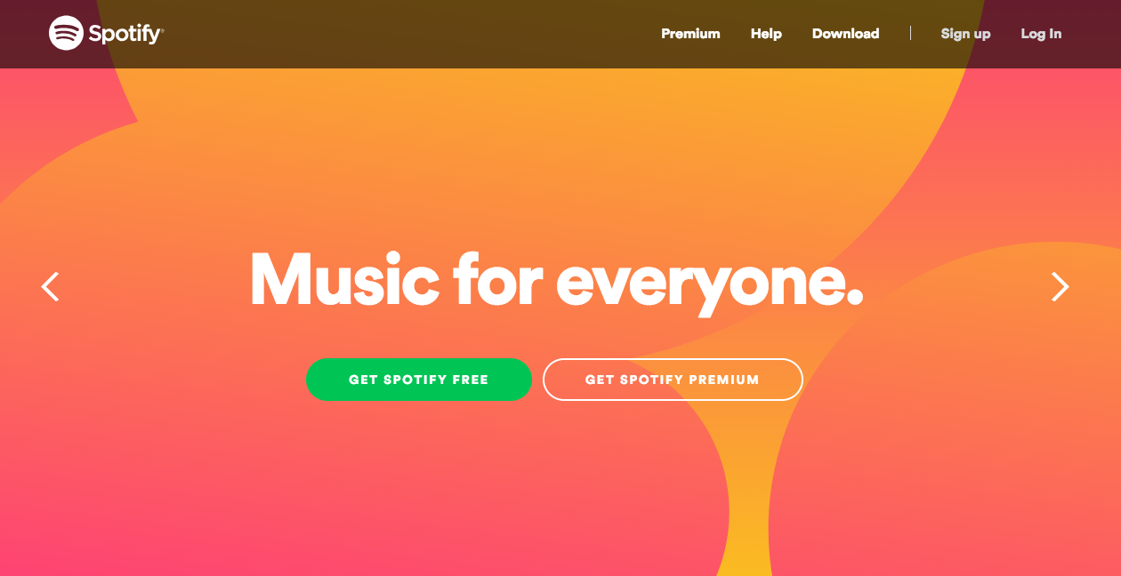
It's interesting to note that they chose to highlight the Free offer instead of the Premium option, which seems to reflect their "freemium" marketing strategy. The idea is to get people to sign up for free, try out the product, then get users to upgrade to the paid version for a better experience.
So, depending on the marketing strategy of your business, if you have two CTAs with different offers, play around with colours to highlight one CTA over the other.
3. Size
The size of your CTA matters as much as the colour of your CTA. You want to attract attention to your Call-To-Action, but not distract site visitors too much from the other content on the webpage that will educate them about your products or services.
4. Placement
When looking at your entire webpage, you want to add your CTA above the fold - that is the part of the page that appears first, before people start scrolling. You can also create "sticky" CTAs, meaning that the CTA stays in position despite users scrolling up and down the page.
You'll notice TrekkSoft's "Get a Demo" CTA on the top right corner of the page, and it doesn't budge.
Creating different Calls-To-Action with TrekkSoft
With TrekkSoft, you can easily edit your CTAs and embed them onto your website. Each CTA will lead to a booking widget which can be embedded to your website. Have a click around to get an idea of what each widget looks like.
1. Content
Depending on where you embed your CTA, whether on your site or on a partner's website, you can select the appropriate "Content" for the context.
Displays all your activities or create a customised list of activities to display. This is only available with TrekkSoft's website builder.
Directs users to the product description page of a specific activity.
Directs users to the booking page for a specific activity.
If you run an online shop selling souvenirs and such, use this CTA to direct users to your shop.
2. Button Settings
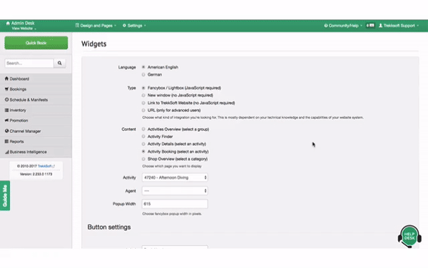
Finally, you can edit the text and colour for each button. To do so, head over to Design and Pages at the top navigation bar and click on Website Integration.
You'll be directed to the Widgets page where you can play around with the different settings until you're satisfied with the outcome.
Edit your CTA's text and colour, then click on Generate Code. You'll get a preview of your CTA and you can click on it to check it out.
Copy and paste this code to your website and you're good to go!
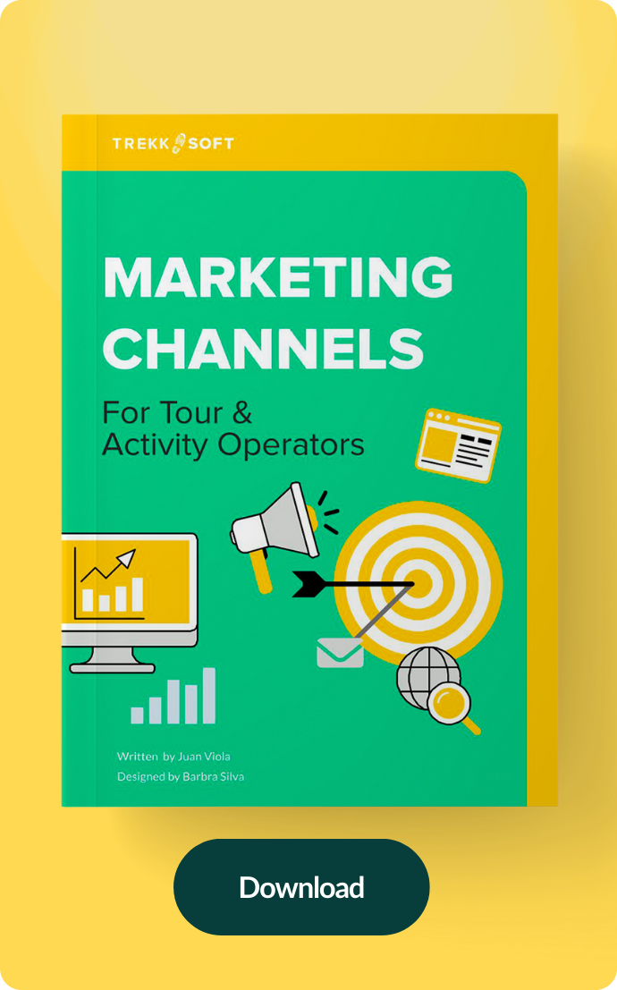
Want to learn more about optimising your website for conversions?