Building a website that drives bookings is key to ensuring the long-term growth of your company.
The more bookings you get directly on your website, the less you're paying to OTAs, partners, agents and resellers. It also means you're less dependent on 3rd parties, giving you more control over how you want to market and sell your trips.
To strengthen your site and drive more bookings, follow these 5 tips.
1. Be clear about your offer
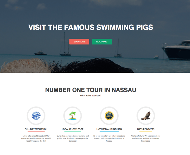
I love this seemingly simple piece of advice from CrazyEgg about writing headlines and subtitles: "First, tell readers in no more than 10 words, What we do. Below, quickly and concisely define, How we do it."
When people land on your homepage, your headline should answer your most popular questions clearly and above the fold (thats the bit of the screen that appears before you start scrolling down).
Frankly, I don't think they can get any clearer than this.
2. Keep it simple
Turning to psychology, the "Law of Pithiness" says that human beings simply prefer things to be clear and straightforward, while avoiding situations that could be complicated and messy.
If we apply this theory to building websites that convert browsers into booked customers, the lesson is clear: Keep it simple.
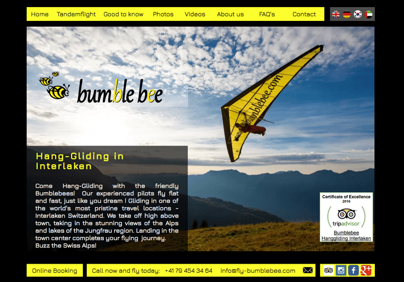
Bumble Bee is a great example. The website is easy to navigate, straightforward yet provides you with all the information you need to make a booking.
- Content - Make sure it's simple, short and easy to understand.
- Put your most popular tour or activity front and center of your homepage.
- Remove distracting links and buttons.
- Use empty space in your design. (It's the easiest way to create a professional looking page without all the fancy design.)
Read more about applying psychological theories to web design on the Kissmetrics blog.
3. Use real human beings
We've talked about this before but it's worth mentioning again - your website needs to feature real people, especially if you're just starting out.
Social proof refers to evidence that other people have gone on your trips and LOVED IT. Use reviews from social media and TripAdvisor to give your site a boost. Let customers gush about your trips in their own words.
You can also use pictures and videos of your tours to let prospects know what to expect when they sign up to your tours, like this one from Sandemans Berlin.
4. Use inclusive pricing
It's one thing to get customers to your site and start browsing. It's another thing to get them to click on your "Book Now" button and complete the booking and payment process.
One thing that really turns customers away is by promoting your trips at one price, and having them complete the entire booking form to find out it actually costs $50 more. Regardless of why this might be the case, it's annoying and an unexpected surprise like that can turn customers away or send them Googling for your competitors.
Be upfront about what your trip costs and explicitly state what the cost includes and excludes.
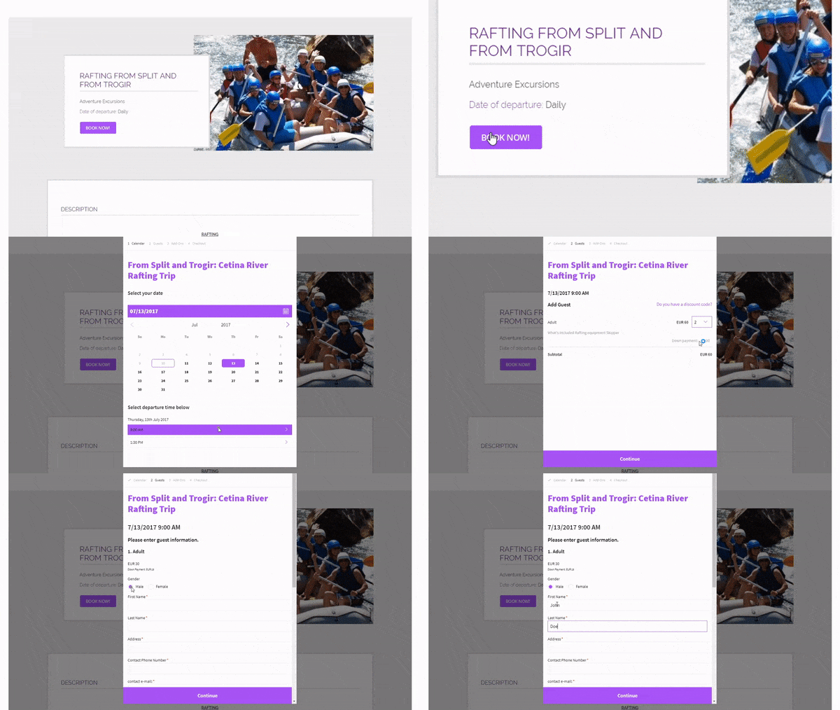
5. Use a Book Now button
The best thing you can do for your customers is to include a "Book Now" button to your website. It makes the whole booking process a lot simpler for them (and for you too).
Experiment with the text, colour and placement of your "Book Now" button.
TEXT
Here are some things your button can say apart from "Book Now":
- Save your seat
- Reserve a spot
- Book your trip now
- "Get busy living" (My favourite one used by Outdoor Interlaken.)
COLOUR
According to Practical Ecommerce, orange invokes a sense of anticipation which makes it a great colour for call-to-actions. Why not give that a shot?
PLACEMENT
Fitt's law that states the time required to move your mouse to the target area like your "Book Now" button is (1) a function of distance to the target and (2) size of the target.
Kissmetrics used the example of a hotel that replaced it's booking form with a red "Book Now" button at the top of the page. This change resulted in an increase click-through-rate by 32%.
Read more: How to design and optimise your "Book Now" buttons with TrekkSoft
Relevant articles:
- Learn more about CTAs with these 7 steps to increase your conversion rates
- Drive more traffic to your website with these 7 tips
- Learn about basic SEO: How to create natural and SEO-friendly content
Get more tips from this free guide to convert more broswers to booked customers. It comes with a printable checklist too!

